How to style announcement bar in Ghost website
Learn to style your announcement bar in Ghost by adjusting width, position, font size, and adding animations with simple CSS tweaks. Need expert customization for your Ghost theme? Our team is here to help.
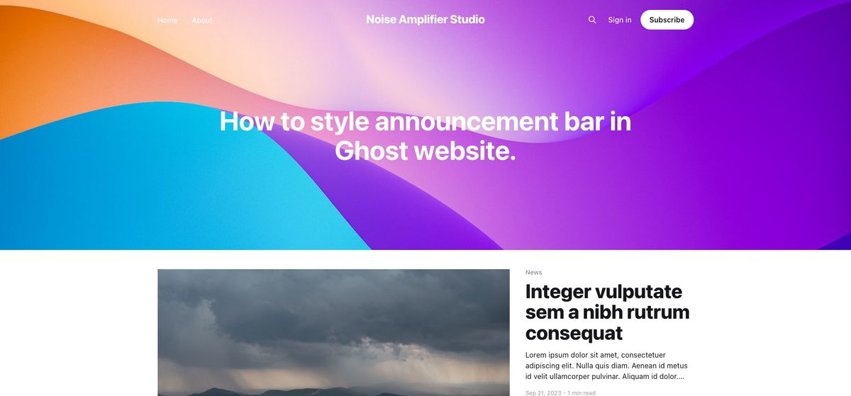
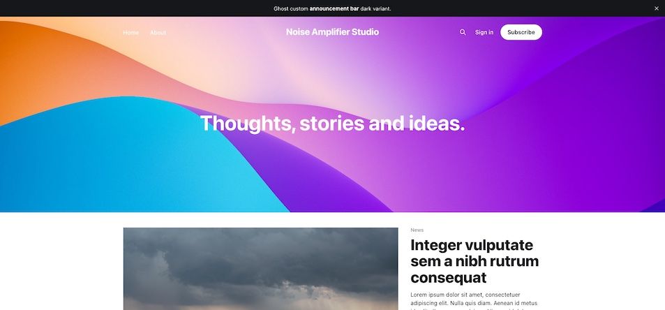
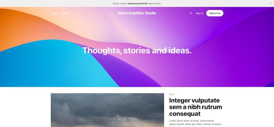
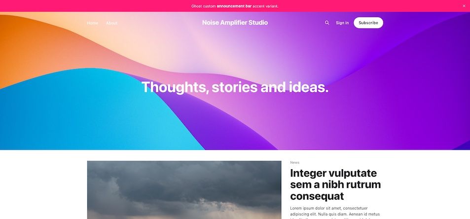
Ghost is a amazing platform under active development and a continuous stream of valuable features. Among the recent additions is the custom announcement bar, a tool designed to inform visitors about important updates on your website. This versatile feature allows for various design choices, enabling you to select the colors and visibility to the different target audience - members (subscribers) or any website visitor.You can choose from the fundamental dark color, light color, or accent color, aligning with the design theme of your website as set in the design settings. However, you may wish to further customize the style to better suit your needs.
In this article, we'll walk you through a few CSS rules that can modify the bar's position, introduce an appealing reveal animation, adjust its size, or even modify its width. Let's explore how we can style and add functionality of your announcement bar.
Ok where should I write this code?
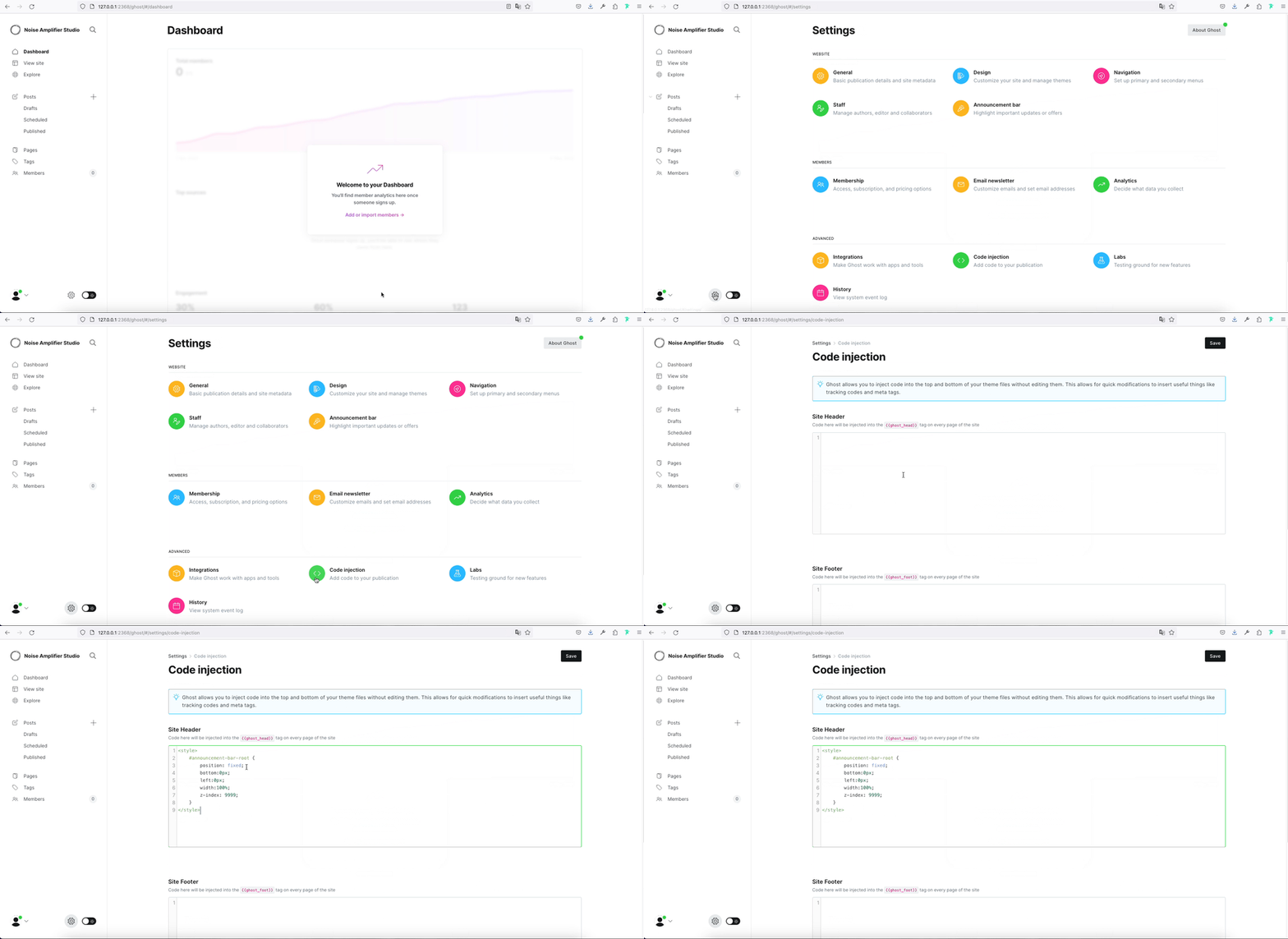
To implement these CSS rules, simply insert them into the <head> section of your HTML document. Here's how you can do it using the Ghost admin panel: Navigate to 'Settings' > 'Code Injection' > 'Site Header' field.
How to change position from Top to Bottom
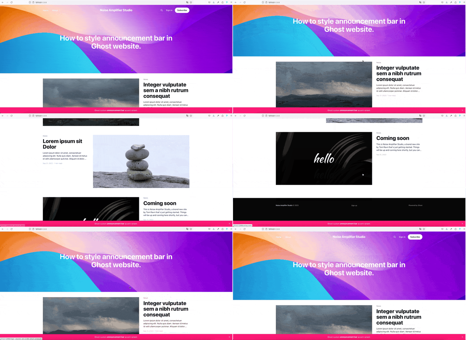
A frequently encountered need is to change the position from top to bottom. Typically, the standard position is static, residing at the very top. However, with this code, we can modify it to a fixed position, ensuring that the announcement bar remains affixed to the bottom edge of the website, making it persistently visible as the user scrolls down. Achieving this adjustment is a simple with the following code:
<style>
#announcement-bar-root {
	position: fixed;
	bottom:0px;
	left:0px;
	width:100%;
	z-index: 9999;
}
</style>The Result:
Adding reveal animation to our bottom announcement bar
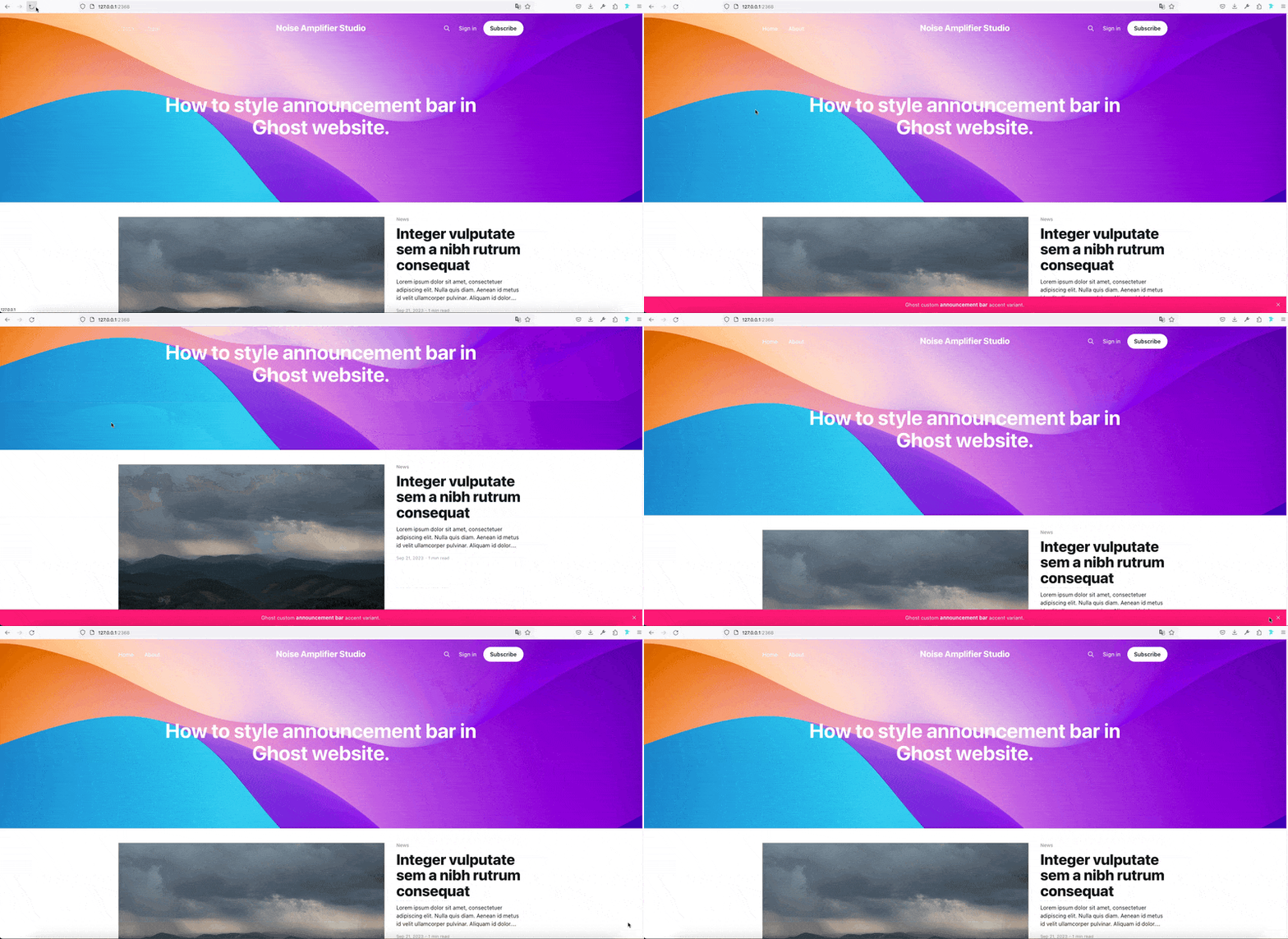
Now, let's enhance our announcement bar by adding a reveal animation with a 2 seconds delay. Here's the updated code:
<style>

    @keyframes slide_up{
      0% { opacity: 0; transform: translateY(100%); }
    100% { opacity: 1; transform: translateY(0); }
    }

    #announcement-bar-root {
        position: fixed;
        bottom:0px;
        left:0px;
        width:100%;
        z-index: 9999;
        transform: translateY(100%);
        animation: slide_up .2s ease-out 2s 1 normal forwards;
    }

</style>
We've defined @keyframes animation named "slide_up" and we added 2 rows into our #announcement-bar-root CSS rule:
transform: translateY(100%);
animation: slide_up .2s ease-out 2s 1 normal forwards;
Result:
We have control over the animation speed through the animation duration property:
animation: slide_up .2s ease-out 2s 1 normal forwards;
Or we can change delay of animation:
animation: slide_up .2s ease-out 2s 1 normal forwards;
Feel free to play with this values to find what is suitable for you.
Changing font size of announcement bar
In this guide, we'll demonstrate how to change the font size of your announcement bar. Simply add the provided code, and you'll see the results instantly.
<style>

    @keyframes slide_up{
      0% { opacity: 0; transform: translateY(100%); }
    100% { opacity: 1; transform: translateY(0); }
    }

    #announcement-bar-root {
        position: fixed;
        bottom:0px;
        left:0px;
        width:100%;
        z-index: 9999;
        transform: translateY(100%);
        animation: slide_up .2s ease-out 2s 1 normal forwards;
    }

	.gh-announcement-bar-content{
        font-size:2.5rem !important;
	}

</style>
Result:
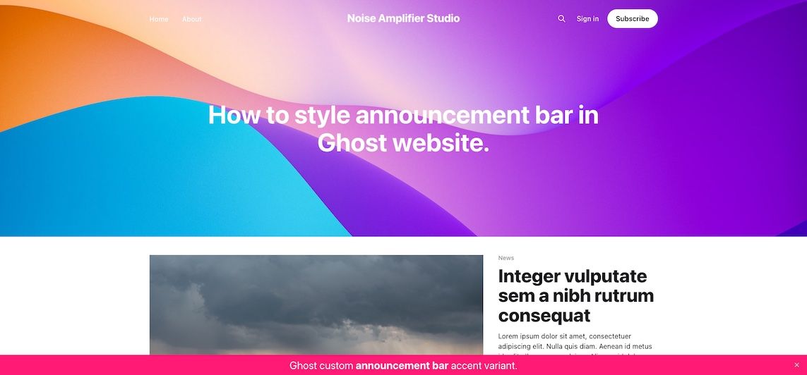
Customizing the Announcement Bar Width
Let's explore how to adjust the width of your announcement bar. You can achieve this by modifying the 'width' value in your CSS code.
<style>
    @keyframes slide_up{
      0% { opacity: 0; transform: translateY(100%); }
    100% { opacity: 1; transform: translateY(0); }
    }

    #announcement-bar-root {
        position: fixed;
        bottom:0px;
        left:0px;
        width:350px; /* from 100% to fixed with 350px in this case */
        z-index: 9999;
        transform: translateY(100%);
        animation: slide_up .2s ease-out 2s 1 normal forwards;
    }
    .gh-announcement-bar-content{
    	text-align:left !important; /* We aligned text to left */
    }

</style>
Result:

In this guide, we've shown how to style your announcement bar by making changes to its width, position, font size, and adding a reveal animation. These modifications are easily achieved using minimal CSS code.
If you're seeking tailored customization for your Ghost theme or require expert development assistance, our team is ready to assist you.


